Kairo
About
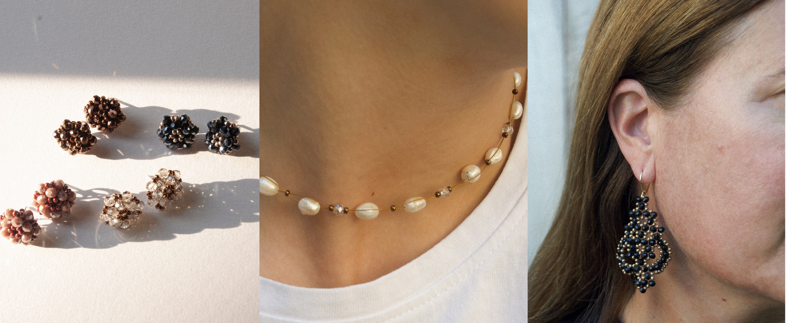
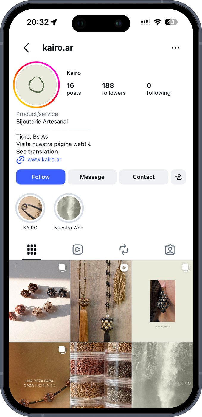
Kairo is an artisanal jewelry brand inspired by organic forms and natural materials. The identity is built around simplicity, balance, and elegance.
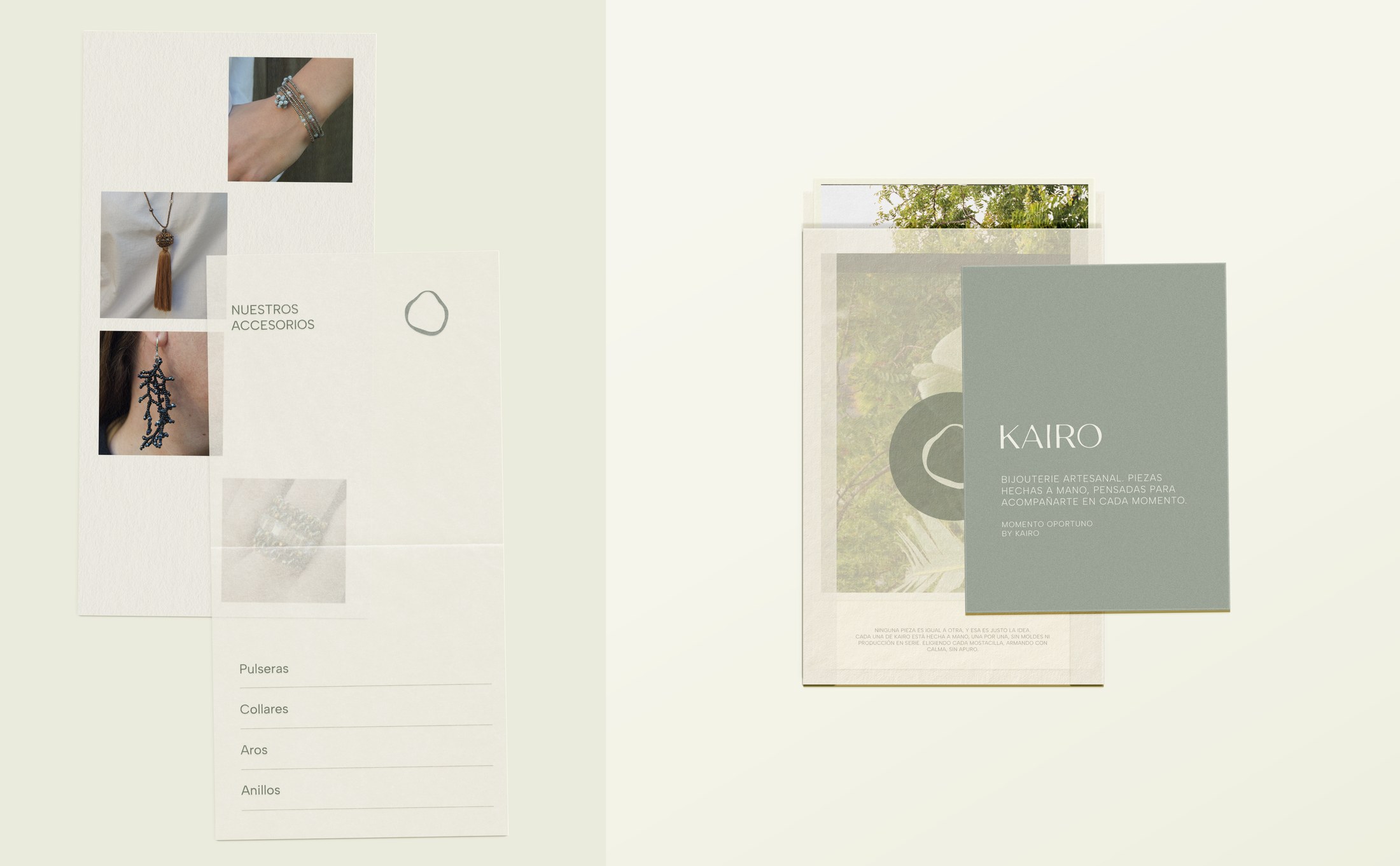
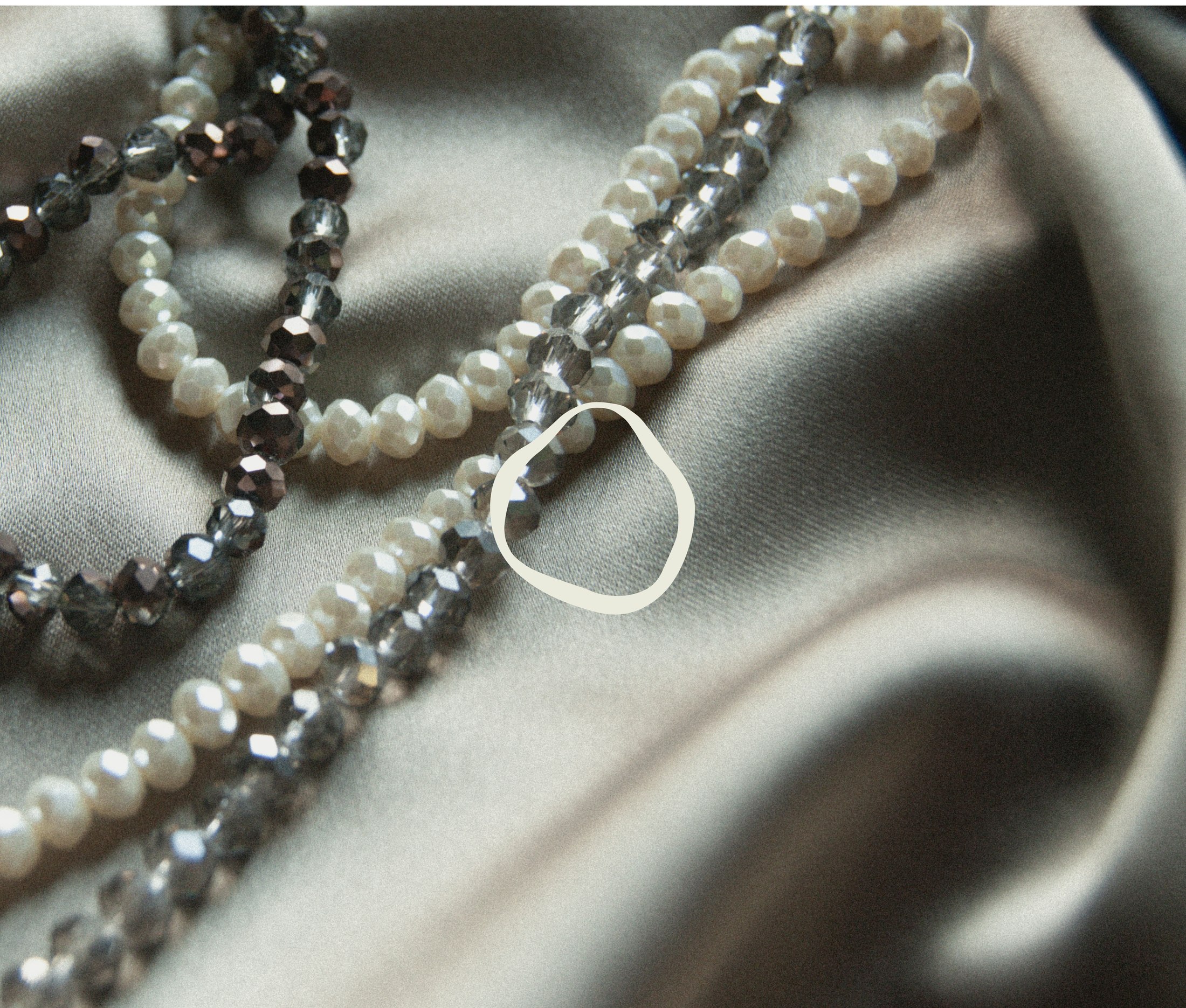
The logo is based on an abstract, irregular shape inspired by natural stones. It works both as a primary mark and as an independent symbol, creating a flexible and cohesive identity system.

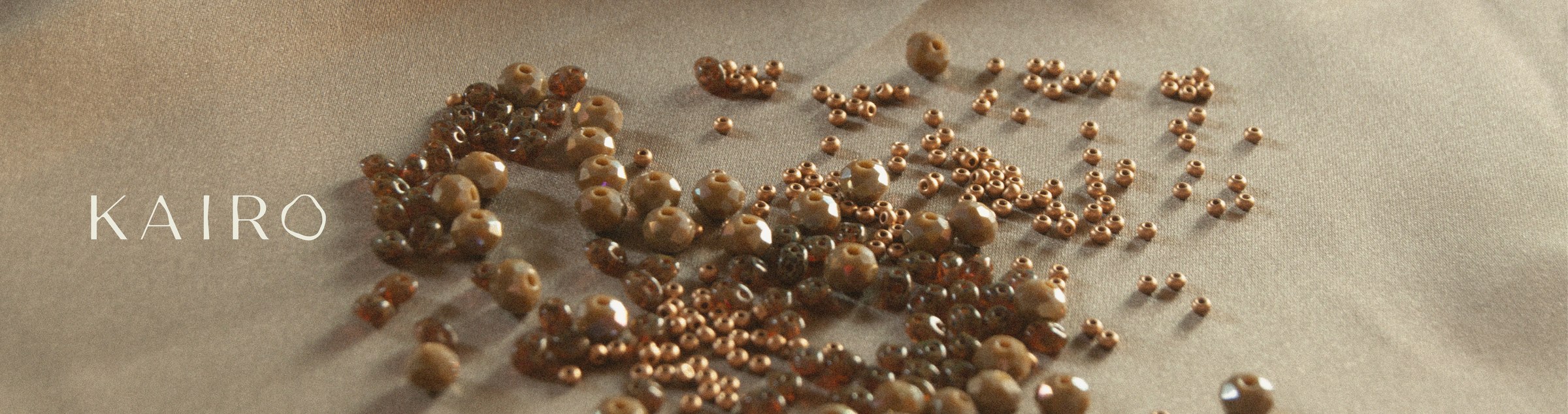
The color palette is composed of greens and warm neutrals, evoking raw stones, earth, and handcrafted processes. The visual language feels calm and intentional, allowing the pieces to remain the focus.

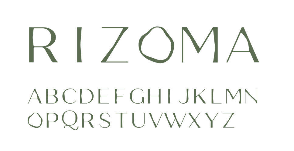
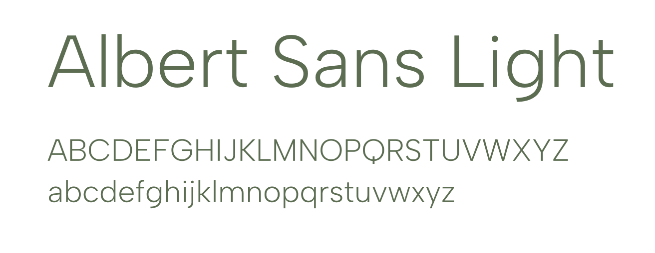
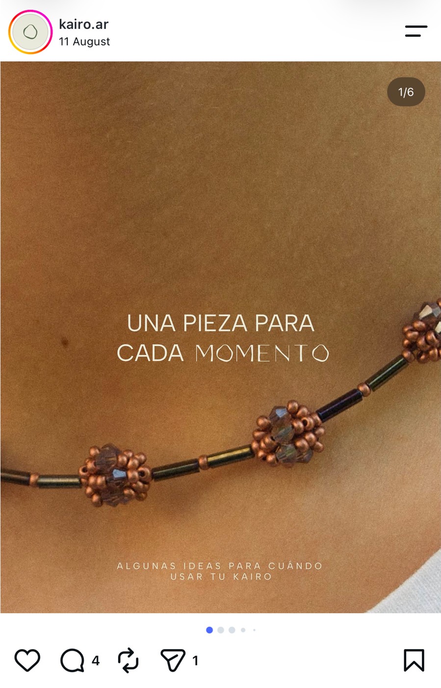
A custom typeface, “Rizoma” was developed specifically for the brand. Its soft contrasts and refined structure reflect the organic quality of the symbol, reinforcing the idea of uniqueness and handmade production.